by Andrew McQuilkin, BHDP Architecture
Each year seems to bring with it a new headline on how one of our most frequent shopping experiences—buying groceries—will be forever changed. Curbside pickup. Driverless cars delivering to our homes. Automatic checkouts.

The technological rush shows a willingness by the largest chains to ensure they outmaneuver online upstarts and avoid suffering the curse of the department store. What used to be destinations for retail and socializing—fun places to shop with memorable and unique design features—became utilitarian and generic, so much so that they lost their appeal and relevance.
Consider this: Sales at department stores have fallen more than 35 percent from their peak of $232 billion in 2000. Meanwhile, groceries have seen sales rise nearly 60 percent over that same period, according to the U.S. Census Bureau.
Some of the growth of groceries has come by adding products common at department stores, such as apparel, beauty and personal care items. But grocers should look beyond just department store categories. They should incorporate the flair and keen understanding for marketing that made department stores so successful for so long.
What Ralphs can learn from Macy’s
Merchandising: It all starts with the product assortment and display—the various sizes, shapes and packaging of products which influence the fixtures used to present them. Even with soft goods, groceries have been slow to expand beyond the versatile metal gondola fixture.
Department stores, meanwhile, use upwards of 100 fixtures, everything from racks, hang bars and tables for apparel to showcases and back islands for cosmetics. Groceries should recognize the product itself is your best brand messenger and storyteller, and its display should not be hindered by store fixtures. Simply put, perhaps a beige metal gondola is not the best way to display apparel and beauty products.
Visual displays: Whether customized at the store level or handed down from corporate, visual displays tell shoppers of seasonal trends, brand lifestyles or product benefits—and engender confidence and purpose. The best that groceries have historically done are stacked, branded endcaps with large prices. Department stores, however, devote entire budgets and regional teams of visual merchandisers along with mannequins, display tables, toppers and banners.
Since customers expect—and enjoy—having their imaginations engaged, grocers should dedicate more areas to displays and tell cross-merchandising stories that combine apparel, home and food.
Lighting: The top way to sell more products and create visual interest is through great lighting. The best approach is a layered one. Start with a functional level of lighting to help guests clearly read labels and employees to perform their jobs. Beyond that, add brighter impact for key messaging, displays and architecture.
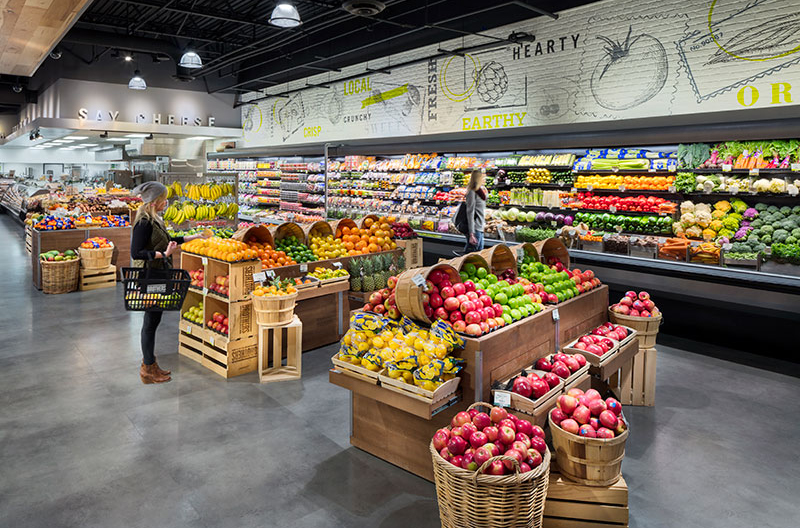
Like department stores, groceries should use more spot lighting on apparel, as well as fruits and vegetables, to highlight them from a distance and enhance the products’ textures by creating deeper shadows. Plan out where to subtract light for dramatic contrast, and don’t forget to leverage natural daylight as it has proven to increase circulation, mood and time spent in stores.
Brand expression: In most groceries, the brand story is relegated to the band of signage above the cases, the cash register light poles and a series of black-and-white historic downtown images at the front. As department stores have shown, design and architecture can play a much more prominent role in better delivering a grocer’s brand and overarching message.
Before finalizing perimeter fixture plans, carve out a foot or two of vertical space to bring brand-focused finishes down to customers. For instance, instead of just a Starbucks area in the coffee aisle, introduce highlighted zones within the aisle that highlight special services, categories and brands.
Graphics/signage: At its core, wayfinding should help guests move through stores, as department stores have done to guide shoppers through each of many showrooms. Groceries should try this simple test. Take a photo of a typical department and make a horizontal mark at the bottom of each sign and message. If the marks create a nearly continuous line with few or no gaps, you are asking the guest to absorb too many messages. There should also be no more than five vertical information points.
Customer journey: This is the intended story that unfolds as guests walk around stores. In most groceries, customers shop the never-ending outside perimeter and must memorize the maze of center aisles. Department stores wisely limit sight lines to a 30-ft. to 40-ft. vista to help tell the story of each area. Groceries can add surprise and delight by breaking up the long center store runs with perhaps wine tastings or a demo kitchen in the center.
Services: While physical stores can no longer compete with online retailers for sheer product selection, the face-to-face conversations with employee experts and the services they provide is a store’s greatest differentiator. For groceries, it’s long been the butcher, as well as newer services like clinics, catering and delivery. Department stores have long boasted beauty consultants, tailors and personal shoppers. As grocers continue to expand their beauty and personal care sections, adding consulting services may be the next logical step. Also, beyond catering, they could also look at party planning.
Amenities: With more apparel in groceries, a high-level fitting room experience akin to those in department stores is a must. And as beauty products become more integrated, the placement of testers and mirrors will help shoppers have confidence they’re making the right choices.
Make the pop really pop
While some grocers have already embraced these department store design tenets in their apparel sections, it’s time to bring these ideas storewide. Just as these tips boost sales of beauty products, they also improve the customer experience everywhere from produce and the deli to frozen foods and cereal.
Andrew McQuilkin, FRDI, is the past international president and chairman of the Retail Design Institute and retail market leader at BHDP Architecture, Cincinnati, where he provides design leadership for forward-thinking retail organizations. To connect with McQuilkin, email [email protected].

