

Mrs. Freshley’s, a line of snack cakes and pastries from Flowers Foods, is debuting a fresh look this spring: redesigned packaging with a contemporary twist and a logo to match.
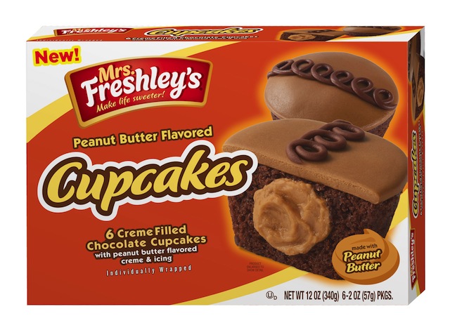
The packaging highlights Mrs. Freshley’s sweets through vivid colors and easy-to-read product descriptions. Each multipack box features product images, while the cellophane-wrapped, single-serve packages showcase products through a clear-view window or a photo.
Mrs. Freshley’s new logo boasts a bright, bold color scheme of red, white and gold tones to compliment the large font. The logo features the brand’s new tagline, which encourages consumers to “Make life sweeter!” by choosing Mrs. Freshley’s sweet treats. After the brand conducted an initial round of research, the results showed consumers prefer Mrs. Freshley’s new packaging due to the increased size of the logo and product images, which make it easier to spot on shelves, according to the brand.
“We’re thrilled to introduce our new packaging to our consumers,” said Meredith Butler, Mrs. Freshley’s brand manager. “The updated packaging conveys the message that this is the snack of today’s on-the-go lifestyle or anytime.”
Mrs. Freshley’s new packaging will be introduced nationwide over the next six months.