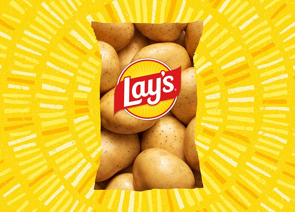
Lay’s Potato Chips, a PepsiCo brand, has begun the largest redesign in its nearly 100-year history, aiming to showcase how its chips are made with real potatoes and announce it is removing artificial flavors and colors in the U.S.
Lay’s works with more than 100 family-owned farms across North America, and PepsiCo sources crops and ingredients – such as potatoes – from growers in more than 60 countries around the world.
Many of the potato farms are near PepsiCo’s cooking and packaging facilities, which means that during harvest season, it’s possible for potatoes to go from farm to bag in as little as 48 hours.
“The new visual identity celebrates the humble, farm-grown potato – where every Lay’s potato chip starts – and heroes the ingredients that deliver the unmatched flavor consumers have always loved,” said Alexis Porter, PepsiCo’s VP of marketing, Global Lay’s.
Consumers at the heart
All core Lay’s products in the U.S. will be made with no artificial flavors or colors from artificial sources by the end of the 2025. In addition, this will expand to Lay’s white dips in early 2026.
“At Lay’s, delighting our consumers goes beyond bold flavors – it’s about delivering trusted quality from farm to bag,” said Denise Truelove, SVP of marketing, PepsiCo Foods U.S.
“These updates were shaped directly with our consumers, offering more choice, more transparency and more joy with every bite. Lay’s continues to set the gold standard in snacking, and we’re proud to carry that legacy forward.”
Lay’s Baked and Lay’s Kettle Cooked chips also are getting an ingredient update.
Lay’s Baked will be made with olive oil and have 50 percent less fat than regular potato chips, and a new version of Lay’s Kettle Cooked Reduced Fat Original Sea Salt will be made with avocado oil and offer 40 percent less fat than regular potato chips. Additional options across PepsiCo’s food portfolio are coming in 2026.
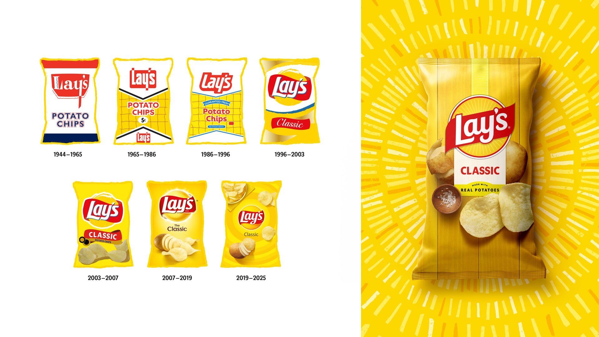
Breaking down Lay’s redesign
Lay’s new visual identity was revamped by PepsiCo’s Design and Innovation team.
While the Lay’s logo has always featured a yellow sun, the team made it warmer and distinct. Sun rays, or “Lay’s Rays,” beam out from the logo, a nod to the light that helps potatoes grow.
A refined color palette was inspired by the ingredients of Lay’s recipes – green, brown and red. Enhanced photography showcases its quality with close-up visuals that highlight the color, texture and seasoning of each chip.
“This redesign, the brand’s biggest in nearly a century, is a love letter to our origins,” said Carl Gerhards, PepsiCo’s senior director of design, Global Lay’s. “With the new Lay’s visual identity, our team created a flexible design system that celebrates the brand’s famous flavors in countries around the world.”
With this new global redesign and the removal of artificial flavors and colors in the U.S., Lay’s is positioning itself for the next 100 years.
[RELATED: PepsiCo Refines Sustainability Goals With Updated Targets]