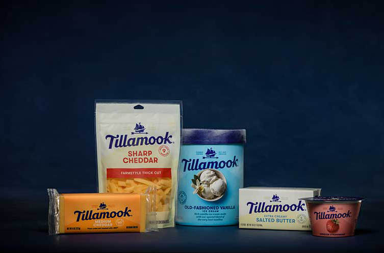
The Tillamook County Creamery Association (TCCA) turned 110 years old on Feb. 13, 2019. The farmer-owned co-op, located on Oregon’s Pacific Coast, will mark the occasion by rolling out what it says is a “bolder, friendlier and more consistent look” across its entire line of dairy products.
The new logo will appear on all company touchpoints in early 2019 including its buildings, touring VW buses and on its website.
Tillamook’s first major logo and packaging makeover in more than 60 years comes at a time when its products are available at more locations nationwide than ever before.
“Product innovation and rapid distribution expansion across the country has fueled more than 60 percent growth for our co-op over the past five years,” said TCCA President and CEO Patrick Criteser. “We want our premium cheese, ice cream, yogurt, sour cream and butter products to come across as unmistakably Tillamook to new and existing shoppers in the dairy aisle.”
Tillamook has introduced more new items in the past four years than in the preceding 40. In addition, the co-op has placed products—for the first time this past year—in more than 4,500 stores in new regions including the Southeast, Mid-Atlantic, Midwest and the Ohio Valley. As Tillamook expands into new territories, Criteser said the company recognized the importance of having a consistent packaging design across all its product categories.
Tillamook brought in Turner Duckworth design agency, which specializes in creating visual identities and packaging for consumer brands, to work on the project. The co-op says its new brand identity looks to the past, with a nostalgic wink, but is delivered in a fresh and modern way.
“Our rich heritage matters, and we wanted to ensure it was reflected in our brand refresh,” said Audrey Crespo, TCCA’s head of design. “We dug into our vaults and borrowed from a couple of old 1950s logos to inspire the new wordmark and reinvented our Morning Star ship icon into a simple, ownable symbol that represents our farmer roots, values and history.”
In 1855, Tillamook’s residents built Oregon’s first official ship, the Morning Star, to carry their dairy products to Portland for broader distribution. The ship has since become a symbol for the dairy co-op and has been found on Tillamook packaging and logos throughout the years. Crespo said the ship’s design is now incorporated into a weather vane on Tillamook packaging, which highlights the company’s farmer-owned heritage with a symbol often found on the rooftops of barns and farmhouses.
“We also de-cluttered our packaging and revamped our color palette to enhance our food photography’s mouth-watering appeal,” added Crespo. “The clean packaging reflects our brand and products with its simple, approachable and bold design.”
Criteser emphasized that while Tillamook’s packaging is changing, the dairy products inside are the same.
The new look will begin rolling out nationwide in February and March.

