
The J.M. Smucker Co. is unveiling redesigned packaging for its Smucker’s fruit spreads — the first visual overhaul in nearly three decades.
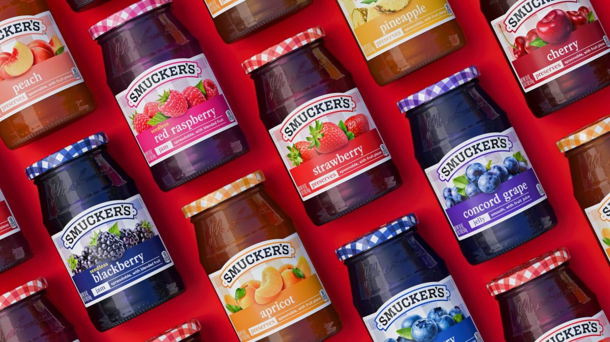
The new jars began hitting shelves this spring, building on the brand’s iconic ’90s-era design with bolder colors, larger fruit imagery and an expanded use of its signature gingham pattern.
The gingham — which has long been a fixture on the jar lid — extends to the front label as well. Each flavor gets a distinct color to improve on-shelf identification. The recipe and ingredients remain unchanged.
“This redesign was about honoring the Smucker’s brand’s most iconic assets and evolving them with modern intention,” said Dayna Lewallen, senior design manager, creative and design at The J.M. Smucker Co.
The refresh comes as ’90s nostalgia continues to influence food and consumer culture. Smucker’s is leaning into that sentiment while modernizing the brand’s shelf presence to compete in a category where visual differentiation drives trial.
The company is positioning the updated packaging around expanded usage occasions — from breakfast and snacking to charcuterie boards and yogurt bowls — signaling an effort to move the brand beyond its traditional morning-meal association.
For retailers, the transition means new packaging will roll through distribution over the coming months. The product inside the jar is not changing, so there are no reformulation or ingredient concerns to manage. The visual changes are designed to make flavor identification faster at shelf and give the brand a more contemporary presence in the spreads aisle.
Orrville, Ohio-based J.M. Smucker leads in several major grocery categories including coffee, peanut butter and fruit spreads. Its brand portfolio includes Folgers, Dunkin’, Café Bustelo, Jif, Uncrustables, Hostess, Milk-Bone and Meow Mix.
[RELATED: J.M. Smucker Appoints Two Independent Directors Following Elliott Agreement]