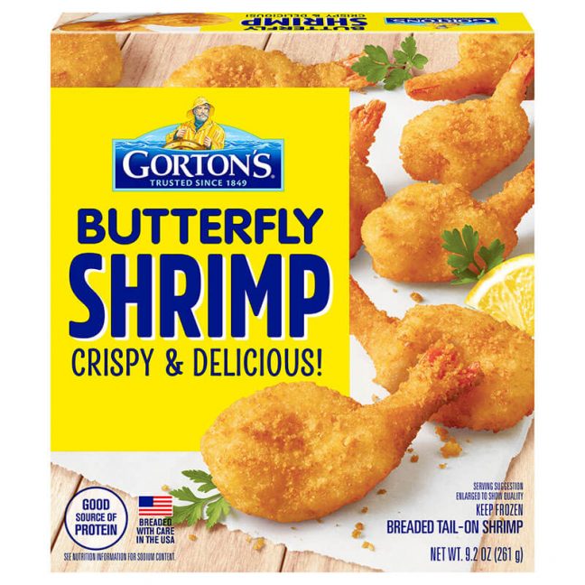
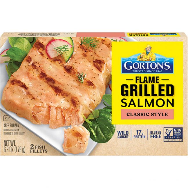
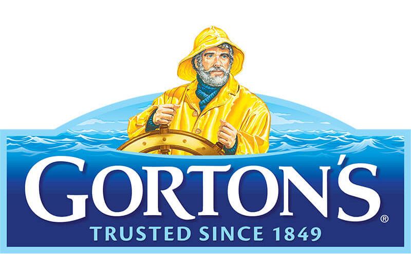
Gloucester, Massachusetts-based Gorton’s Seafood, one of the nation’s leading seafood producers, recently unveiled new product packaging for its smart solutions and everyday gourmet lines. Additionally, all Gorton’s items will now showcase a refreshed brand logo.
Over the past year, Gorton’s has surveyed thousands of consumers to understand who was buying in the category before the COVID-19 pandemic, as well as to gain insights on who began to buy during the pandemic. Specifically, the brand was curious to learn how consumer habits and expectations have shifted, how consumers shop (in-store and online), how younger generations’ shopping habits differ from those of older generations and how prepared seafood fits into their lives.
During that process, Gorton’s also wanted to understand how they could better guide shoppers to the right product for them, which led to packaging and logo adjustments.

“After learning more from our consumers about new eating and shopping habits, especially during the pandemic, we knew we needed to make some integral packaging and logo adjustments that better align with all of our current product pillars,” said Chris Hussey, VP of marketing. “With a wide range of products, we needed to find a way to tie them all together while making sure that consumers still have an easy time shopping and finding what they are looking for. For example, consumers will start seeing a more consistent block of yellow packaging while shopping in our section.”
The key aspect of the design change is the use of the iconic Gorton’s yellow on all packaging. The Gorton’s yellow has been a signpost on key items and helps consumers identify the frozen prepared seafood section in the frozen aisle.
Consumers will find that it will now be even easier to identify the Gorton’s brand and frozen prepared seafood section as the brand has added more yellow across all of its product pillars. The use of more yellow makes each product’s name and benefits clearer and easier to read, so consumers can quickly find the products they are looking for.

Finally, the Gorton’s logo has also been refreshed as an integral part of the packaging changes. The new logo incorporates waves behind the Gorton’s Fisherman to reflect the brand’s mission of bringing the goodness of the sea to everyone.
Consumers across the nation will begin to see new packaging from Gorton’s rollout this month, while the brand’s goal is to feature all new packaging in its partner retailers by the Lenten season.
Since 1849, Gorton’s mission has been to help people everywhere enjoy the goodness of great seafood. The company is one of America’s oldest continuously operating companies. Gorton’s full line of frozen seafood products spans from breaded and battered fish sticks and shrimp, to grilled fish, and innovative product lines such as Simply Bake and Ancient Grains.
Gorton’s products are available in independent and chain grocery stores nationwide.
For more information, visit gortons.com.

